Studio Logo
Introduction
In the second week we finished setting up the studio as a group of 4 students, we started working on the Logo for our studio group Patched. The stratagist of the group asked me to make 1 or 2 logo's designs each person. The versions of the logo consisted of a sketch and a colour version and definitive version. We originally used Adobe Illustrator or Affinity to design the logo's, but also used Figma to share and place the logo's in one page so we can get an overview of the different designs that we have created, so we can pick the best one out of them.
Designing the logo
For a visual representation of our studio's brand identity we needed to make a logo, This logo can also give others can give an positive impression or interests towards our studio, since it makes more it more memorable, but most importantly a distinctive logo makes us stand out from our competitors as well. Me and my group members of the studio group made several versions of the logo that we waned to use for the branding, at the end we will pick the one suits our studio the most.
Process
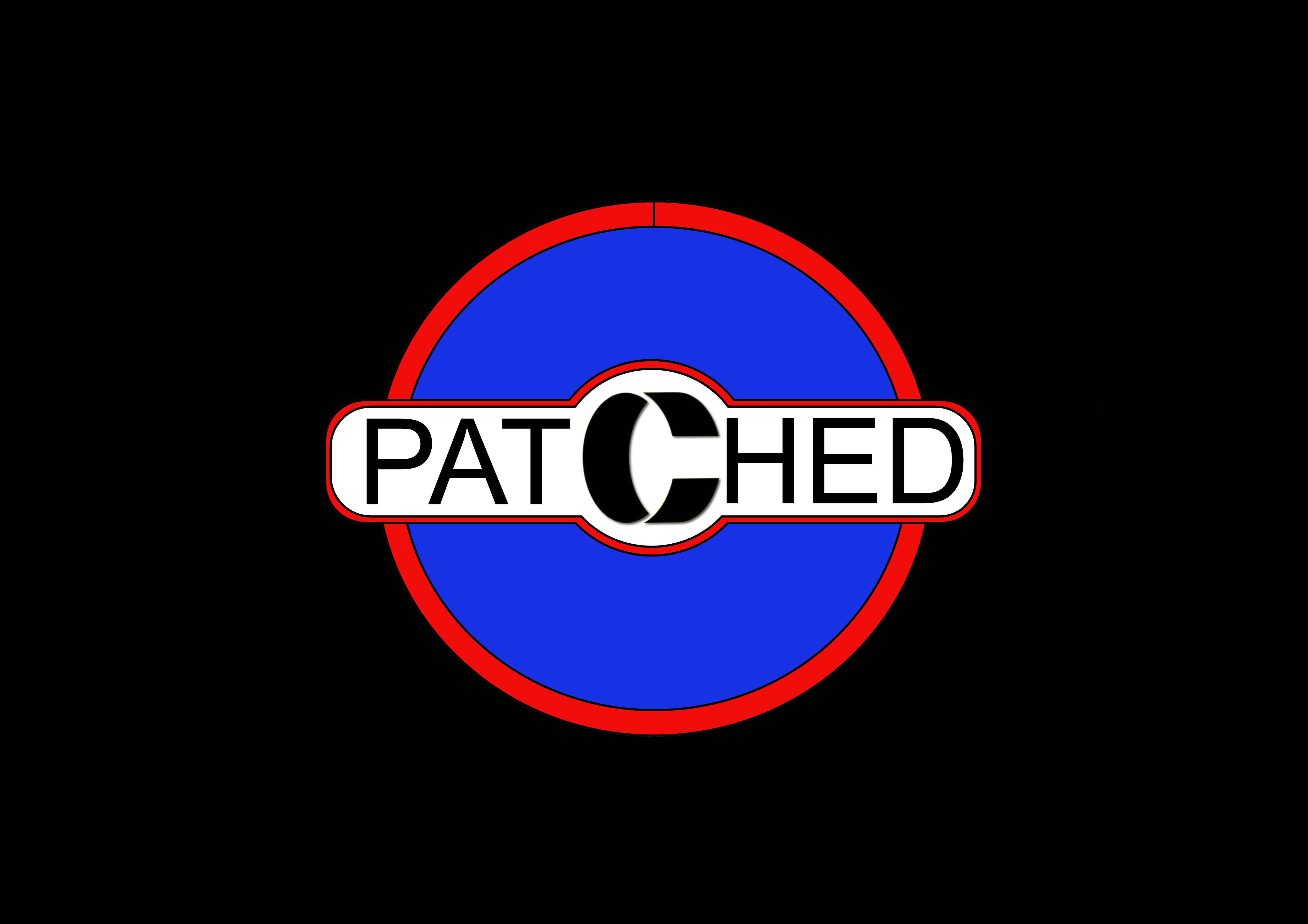
I sketched a logo for our studio, Patched studios using Affinity. The design is simple, but has a meaning behind it. The outlines that i've made for the logo are shaped to look like an bandage, symbolizing the idea of "patching things up". Around the outside, I added a circle to represent Unity and togetherness. In the middle, i wrote the word "Patched", but i gave it a unique twist since, the "C" is designed to look like a 3D first aid bandage. I think this will make the "C" stand out and be easy for people to recognize it when they see the Patched Studios logo.
Final version
This my final version with colours, since we didn't had a fully developed colour palette or theme yet for our studio, I gave the blue and red colours, since it has contrast and balance. These colours are directly providing contrast that draws attention while maintaining harmony. Another reason I think it suits my logo is these are very recognized colours since they appear in many national flags, such as The Netherlands.
Reflection
I'm not that advanced in designing logo's in Affinity or Illustrator yet, but i'm still learning to get better, most of my knowledge and strength is in programming, but knowing how to design things properly coud be a great asset as an upcoming developer myself. This was my first time using Affinity and i think I'm starting to get the hang of it and I also enjoy designing a lot more with Affinity than using Adobe Illustrator. According to my group members the logo looked great, but it's not what they were looking for. They wanted something even more basic, yet powerful at the same time.