Website Portfolio
Introduction
For the upcoming semester 4, I need to complete an internship to graduate as a frontend developer. This portfolio website will play an important role in that process. It will serve as a platform to showcase my learning outcomes and expertise while applying for internships. Additionally, it will highlight my skills and projects that I’ve accomplished.
Process
I went online to browse for some inspiration. I already had a high-quality portfolio from last semester, but I decided to create a new one since Semester 3 feels like a new chapter for me. Compared to my old portfolio, I want this one to be more straightforward, without too many features or effects, but still clear and purposeful. I also want to make sure it’s something I can expand on later.
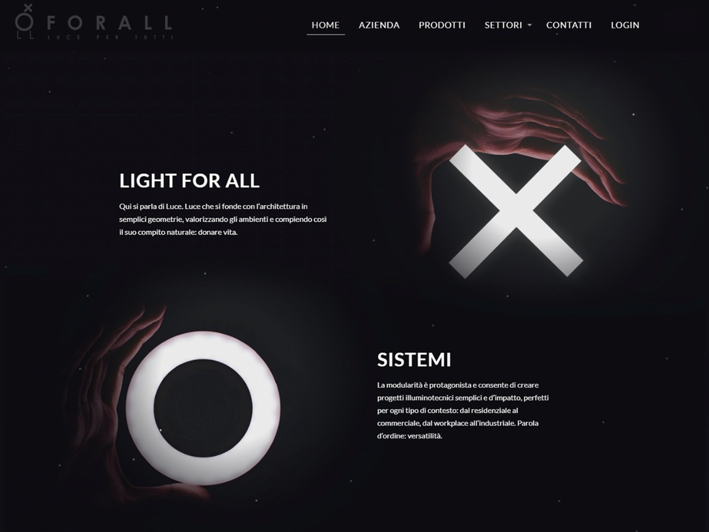
Source: https://www.awwwards.com/sites/for-all-luce-per-tutti
I came across a design on Awwwards.com, a website where web designers share their work and showcase award-winning sites. I really liked the white neon color effect on the black background, so I decided to use that style as inspiration. Instead of white, I’ll go with green since it’s one of my favorite colors, but I’ll keep the black background similar to the original design.
Iterations
Sketching
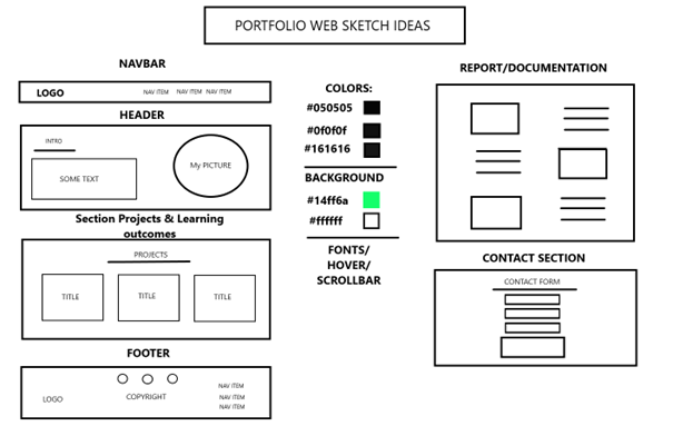
I made a raw sketch of the website layout as an early glimpse of how I wanted my website to look. I handpicked the colors for the design using Adobe Color Picker. The darker/black shades are for the backgrounds of each section, while lime green is for specific elements like text, the scrollbar, hover effects, and other highlights. White will be used for the text, such as paragraphs, to ensure clarity and contrast.
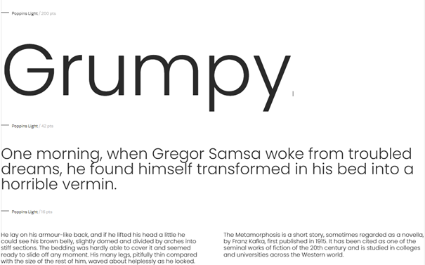
At first, I had no clue which fonts would suit my portfolio site, so I browsed through Google Fonts and chose “Poppins” for my font design. This font seems to be quite popular among users, and it has a modern, clean look, which is exactly what I want for my website.
Iteration 2
I made an Figma high-fidelty version of my portfolio site, with all the fonts and colours and the layouts that I’ve included which I have showcased previously.
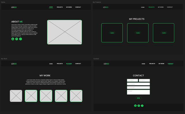
I really liked how this design turned out. My goal is to eventually expand it into a complete portfolio with more features and designs, such as a parallax background (a moving background that responds to scrolling). I have plenty of other ideas I’m excited to implement in the future as well.
End Result
Here’s a small preview of the website. To see the full version, you can check it out using the following link:
- https://i461683.hera.fontysict.net/index.html#home

Opinion and Feedback
Overall, I’m really happy with how this website turned out. I developed it within two weeks using HTML, CSS, and JavaScript. I first presented the website during the 2nd portfolio review after being advised to create a dedicated portfolio site instead of relying on the wiki page in GitLab. I explained that the portfolio website was still brand new, so I hadn’t added much content about what I’ve done yet. The teachers suggested I change the learning outcomes section to make it easier to navigate and showcase my work more effectively. They also reminded me not to forget to include a reading guide.
Reflection
While creating this portfolio website, I realized how important it is to have something like this in place, especially when applying for internships. As I mentioned earlier, I kept the design simple and straightforward to keep my portfolio clear and purposeful. However, I plan to expand and improve it in the upcoming semester, challenging myself to take it to the next level.
For more info regarding this portfolio can be found below in the appendices.